
Why I Love Wordy Quilts
And why I make them, too.

Listen to the audio version here:
POINT: COUNTERPOINT
My desire to write this piece came about after reading this post by Laura Shaw, of her thoughts about the wordy quilts at the 2026 QuiltCon show. Laura’s essay covers far more than the topic of word quilts, but I’m keeping the focus of my response to just that part.
My takeaway from Laura’s essay is that she finds word quilts a bit simplistic, pigeonholed in their era, and she prefers to be engaged through color and composition. My take is that word art is engaging, and that pretty much all art we see will be assigned to its era or movement in future times.
To be clear, my piece here is more counterpoint than criticism.
I love that Laura and I can each publish our own views. And also to be clear, she and I are cordial colleagues so none of this is about asking you, dear reader, to choose a side and defend it to the death! Let’s forgo that exhausting paradigm, shall we? I really enjoyed some of the points she made and how they gave me pause for new thoughts. I offer mine as another way to consider word quilts, and hope that between these two opinions, you find your own.
BACKGROUND
In case you didn’t know, I’ve always been a word-nerd. I got into fonts as a teenager, and have been paying attention to how words and images were used together in the Sunday comics (and later, everything from cereal boxes to editorial cartooning) since I was six years old.
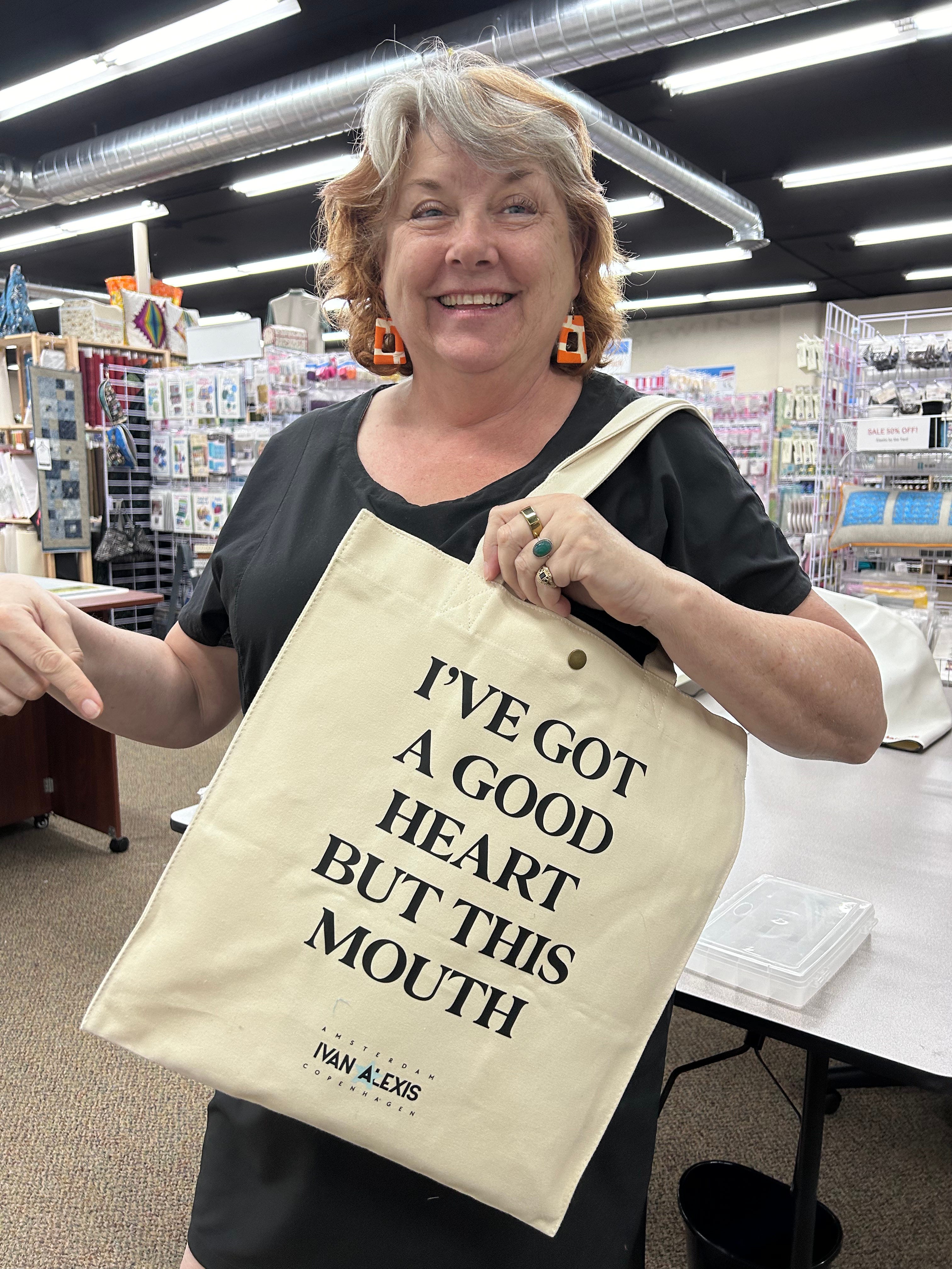
I’m also pretty much a straight shooter, often to the discomfort of the people I love, because to know me is to occasionally be singed by my bluntness. I hope, fervently, that said beloved people also know how much I love them despite this mouth. In the inimitable parlance of my British family, I’m known for calling a spade a bloody shovel.
ART as LANGUAGE
For me, art has always had the capability of operating as another language with which to communicate. When the words we speak can’t penetrate any more, art often can. And sometimes, that means using words in places you don’t expect to find them.
Laura posits that wordy quilts don’t leave you much room for interpretation. It’s all laid out, RIGHT THERE, and you have no where else to go with it, whereas a more abstract, non-verbal rendering of the concept gives the viewer more space for personal interpretation. For me… the more abstract works hit sometimes, but often miss. Sometimes it looks to me like the artist did the thing they usually do (abstraction, minimalism, improv, stripes, curves, transparencies, raw edges, prairie points even, etc.) and then named it something topical like “Heat Dome #17” - and I find myself adrift, not making the connection between the work and title. Ok… they made this during the era of heat domes being all over the news, but I’m not getting the relevance of the pink splotch to “heat” or “dome” - was this about strawberry crops? Pink flip-flops? The Pink Drink at Starbucks? (and I am not refering to an actual work here… just the idea of a fictional one)
I KNOW: This could easily look like I don’t want to think for myself, but my aforementioned friends and I can assure you that I am not without opinions, even when I’m not given a toe-hold into an artwork!
I know that many artists like to do their thing, and leave it up to the viewer to decide what it all means. But I WANT to know the story behind it. I’ve always wanted to know HOW the clock worked, not just that it was time for a cuppa. When it comes to art, I don’t want to look at a cacophony of color and think “nice use of blue,” I want to know that using that blue, to that artist, was about expressing something important to them. I want to GET what they were aiming for, FEEL it. I don’t want to miss the major plot line because I was busy trying to make sense of a splotch of pink in a weird place.
And I also want to say that not all art fails here for me. Much of what I admire transmits its meaning in a way that transcends any limitations in the medium or style of the work - or even its era. For instance, I can see Basquiat’s frenentic commentary on colonialism without reading a single word about it. I can see the quiet power of Artemisia Gentilleschi’s women without knowing the biblical stories that inspired them. Maybe, me not “getting” a work is a combo of it just not being what turns me on and the artist not hitting the mark - or at least not hitting it in a way that resonates for me.
SO: WORDY ART
Here’s the thing about words… once they are written where you can see them, it’s really hard not to read them. Think of trying to ignore closed captions on TV: I get so caught up in reading the words (even ones I can hear clearly) that I stop looking at the rest of the screen.
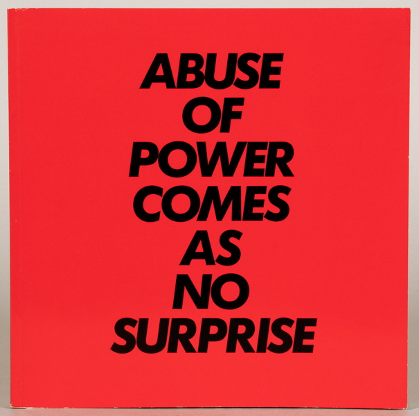
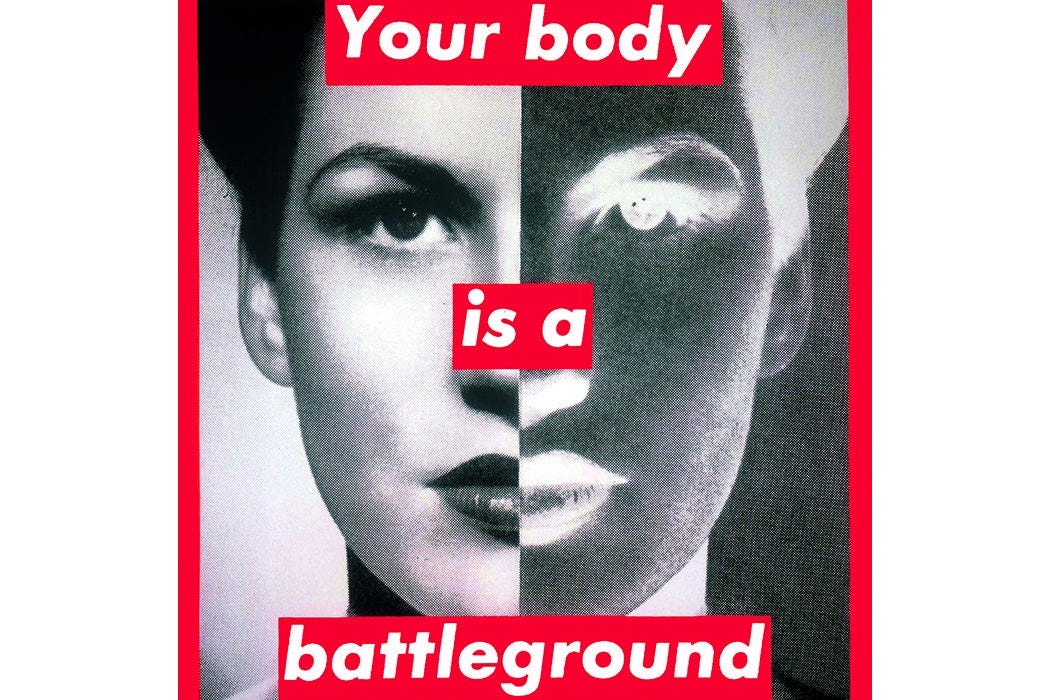
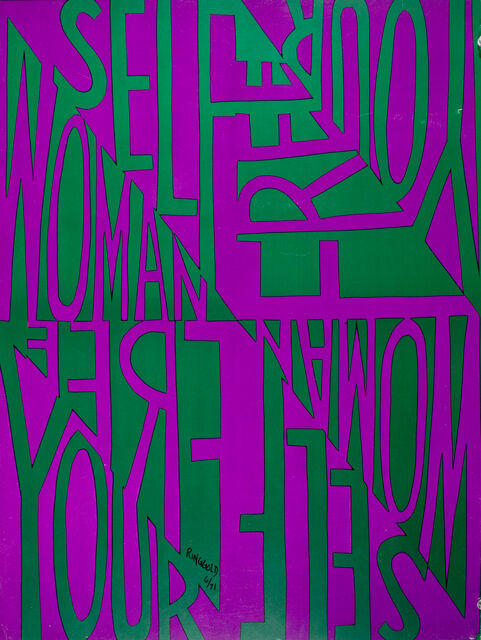
HOW you write words is as much a part of the art as WHAT you write - these are the tools of the word artist. You can write them in unmissably BOLD, plain language, standing as confrontationally tall as a billboard in a small space. You can make them so tiny most people give up after two sentences. You can hide them in layers, making the viewer really work for it. None of this is random, it’s by design: think legalese in a tiny font buried deep in the instructions; make it hard to read, and we WON’T read it.1
When done well, word art can look deceptively simple, yet the longevity of the work and its artists speak to their considerable skill. I offer the 50+year careers of Jenny Holzer, Barbara Kruger, and Faith Ringgold as evidence. And their work is STILL relevant because we’re still dealing with the issues they made the work about.
Laura writes: “When a quilt relies on a worded message to convey meaning it leaves the viewer with no where else to go.”
I offer that maybe that was the point.
She writes: “ People either resonate with the words or they don’t (emphasis mine) And apparently there were a lot of attendees at QuiltCon this year who did not appreciate these messages.”
I offer that NO art resonates for everyone. And I bet there were plenty of non-word works at QuiltCon that were far from appreciated by the all the viewers2; I saw plenty online that were not my cuppa.
And for the record, many artists are not the least bit interested in making you comfortable. Quite the opposite sometimes.
Laura wishes they could have been more subversive, “less reliant on in-your-face messaging, which could’ve possibly drawn people deeper into the work, creating an opening where the quilt’s visuals moved them and then perhaps softened a hardened stance.”
I offer that maybe I’m not interested in a softened stance, nor am I interested in leaving enough room in my concept for you to completely miss my point. I don’t want you to imagine for a hot second that my (fictional) pink splotches might be a stand in for flowers when I’m talking about the number of children who die in the crossfire of war.
LOOK: Laura makes abstracted art quilts, I make wordy ones. OF COURSE we are adept at defending our views and our interests!
YOUR ART, YOUR VOICE
But here’s the the thing: it’s SO important that we write about these things, and especially about our OWN work.
After studying art history all the way up through an MFA, it became obvious to me that that finding primary source information about an artwork - the artist talking/writing about their OWN art, in the era/time/movement it was created - was the way to best understand the art, and where it sat in the overarching pantheon of history. So much canonical art history has erased or misrepresented everything except the art of the white men who controlled the canon. These days, I take with a grain of salt any art history or criticism that doesn’t include the voice of the artist, especially in contemporary art.
I wanted to know more about Laura’s abstract, improv art quilt “Your Mother. Your Daughter. Your Sister. Your Grandmother. You.” so I interviewed her about a year ago for the pod. I wanted to hear from her what she was reaching for when she made the work. Go listen to it here.
And incidentally, despite the work being abstract, and thus open for broader interpretation than its intent, it was banned from a show because the organization thought someone might interpret all that improv as the artist intended (via her statement), and get offended. Here we have a perfect example of a less in-your-face interpretation still not mitigating a hearty clutching of pearls!
One thing that is not up for interpretation is the lengths some people will go to get offended, and how far they’ll take the fight.
ANYWAY, BACK TO THE ART
Just to show you how my brain thinks, when I first saw an image of Laura’s art quilt without knowing what it was about, I saw a riot of red improv, done in a style I feel is common in the last dozen years of what we call modern quilting3; I needed the toehold of the interpretation to want to go deeper. I will also say I don’t have an improv bone in my body so most of the time I’m just impressed with the technicality of making all those seams lay flat… see, I’m already caught up in the construction puzzle. And none of how my brain or any one else’s works is in Laura’s, or any other artist’s control.
No one is for all art.
All art is not for everyone.
But I hope you take the time to decide what IS for you. I’ll be over here playing with words, working to make sure you get my point.
…so you can bury all sorts of terms and conditions in there that we would never agree to if it was both big enough to read without glasses, and written in non-obfuscating language.
Trying to make a universally beloved work is a fools errand - you’ll end up with the artistic equivalent of a beige 4 door sedan that offends few and thrills no one. Trust me, we want our feelings to be moved, and we’ll risk wading through stuff we don’t resonate with - or even stuff that pisses us off - in order to get that thrilling dopamine hit.
This style of improv seems to stem from a toolbox of techniques taught over the years at QuiltCon by various quilt improv artists… Hmm. Chicken or egg?
This post has been bouncing around my head for the last three days. I don’t have a background in art history, and I have not been to QuiltCon. What really struck me was the idea of certain quilts, whether it be quilts with words, improv, or simply using only solids, being representative of their time.
I work in a quilt shop that has a very traditional bent. We carry a lot of reproduction fabrics, and a lot of blenders. Before this shop, I worked in a shop that the owner called modern, because of the lines she carried, and most of the fabrics were very bright. What the modern shop owner would really push to sell the fabric was kits. Kits are easy for people because they don’t have to make decisions, and they know how it will look. Many people make their own decisions, but the focus from the “modern” owner was kits. QuiltCon seems to focus on quilts that are more original designs.
At the more traditional shop, we do not sell kits. We don’t even carry full lines of anything. We are busy! People come in looking for ideas. They may be making a pattern, but they are putting a plan together on their own. Younger women who come in for the first time are in love with the reproductions and tiny flowery prints. Many of the colors popular in the 1980’s are popular with the younger women.
All of that to say, of course in 5 years there may be no words on quilts, and then in 30 years it will be back. And that is a good thing. Art should tell us what is in the makers’ minds and hearts at the time it happens. It gives perspective. What has changed? What hasn’t?
Thank you for giving me some great food for thought!